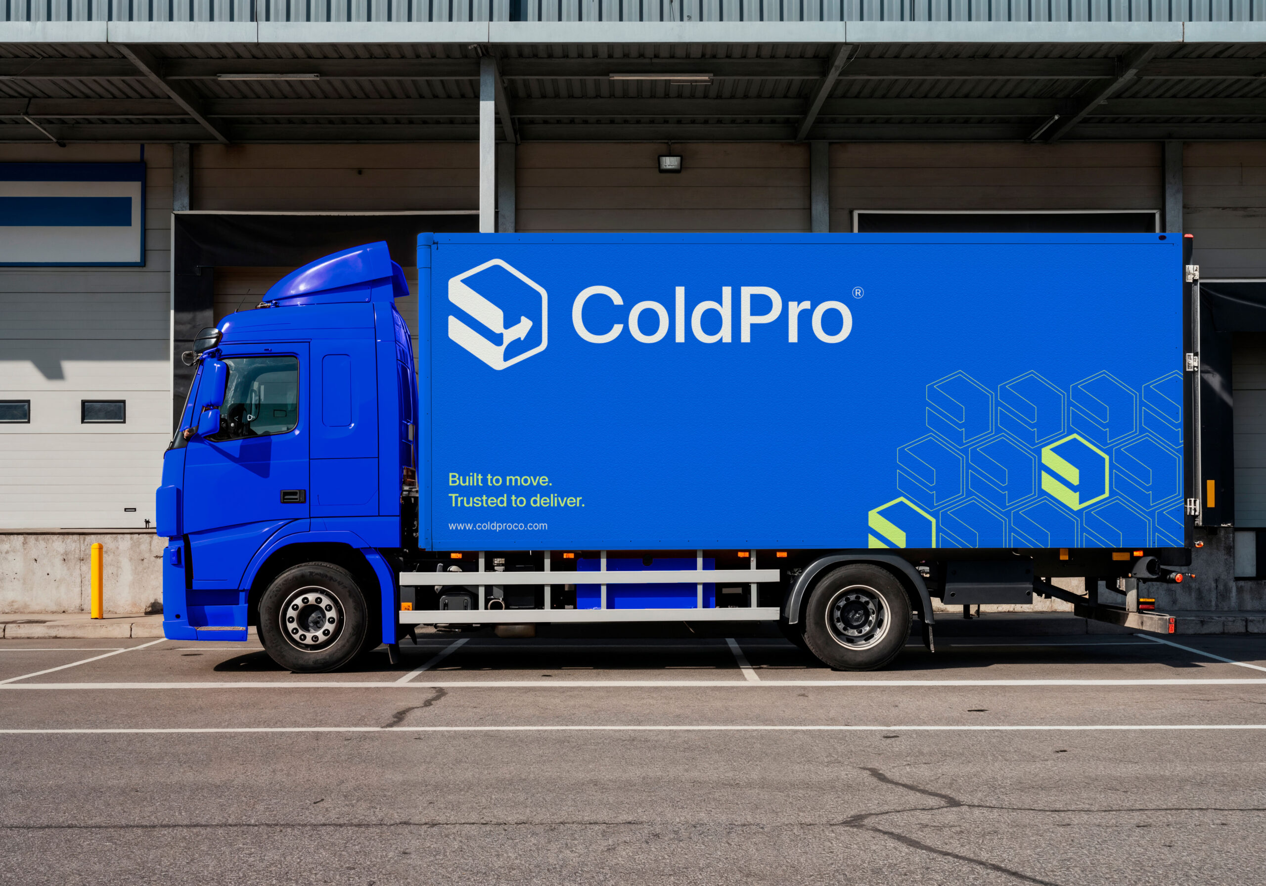
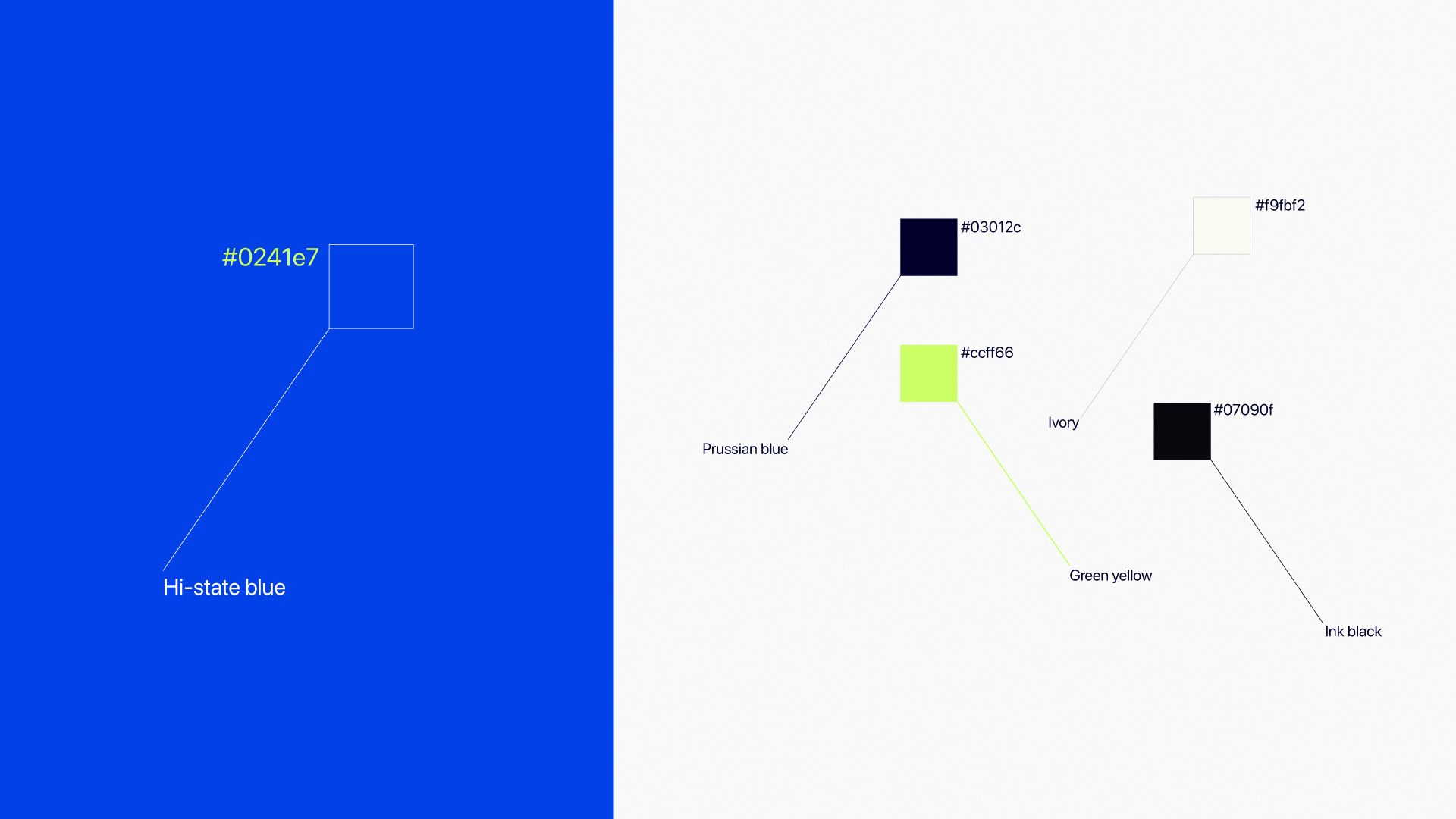
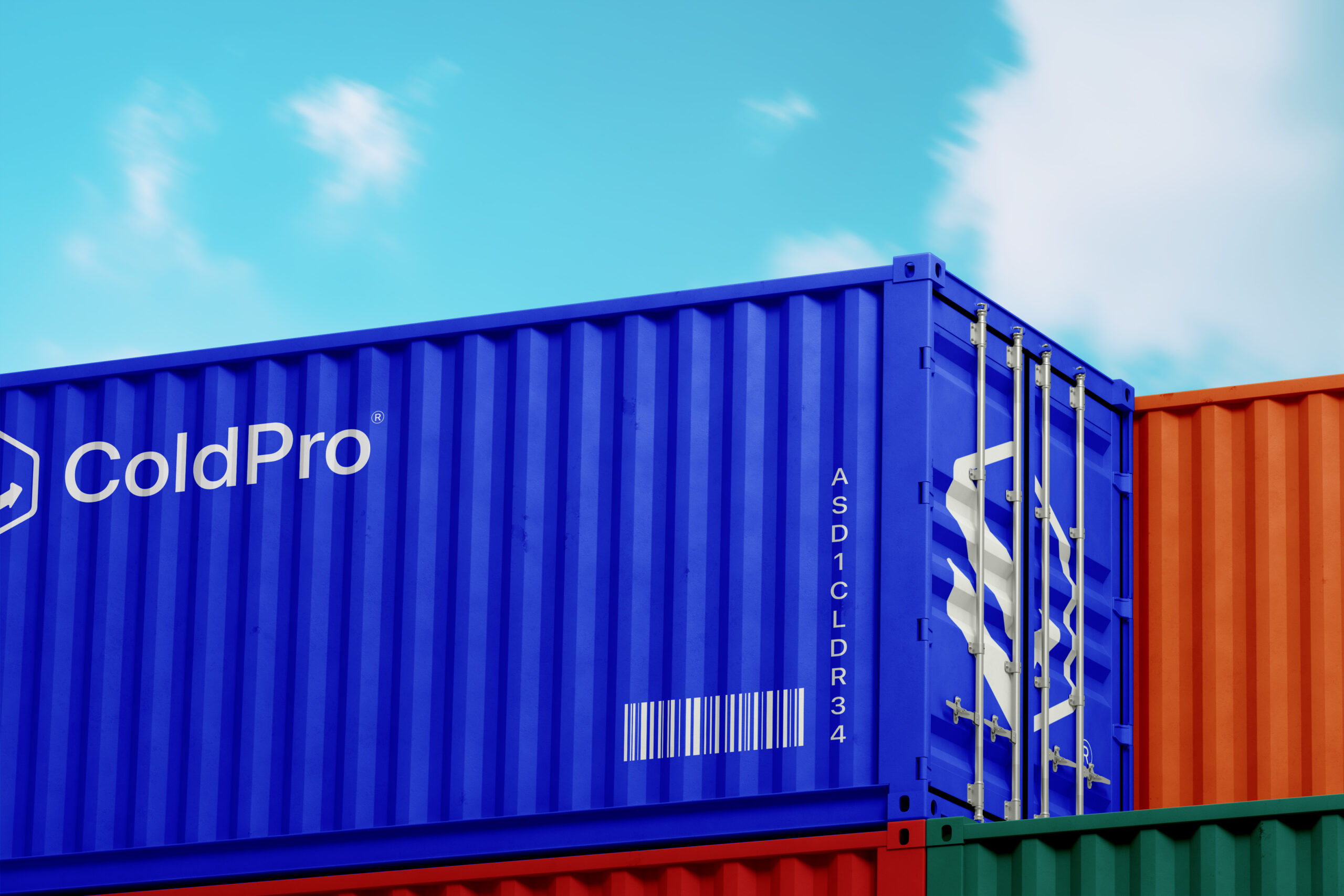
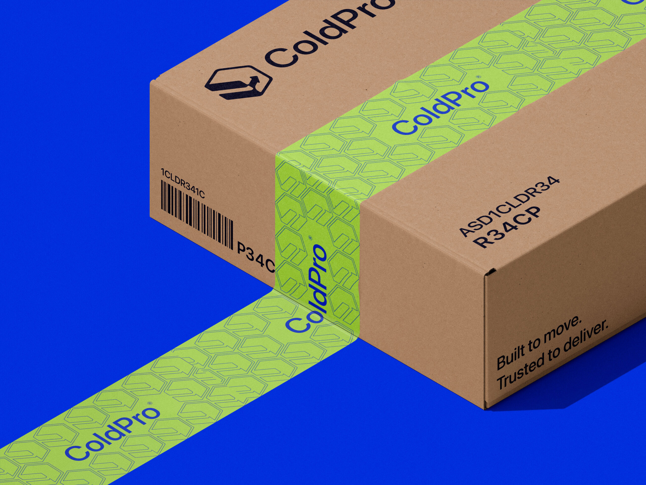
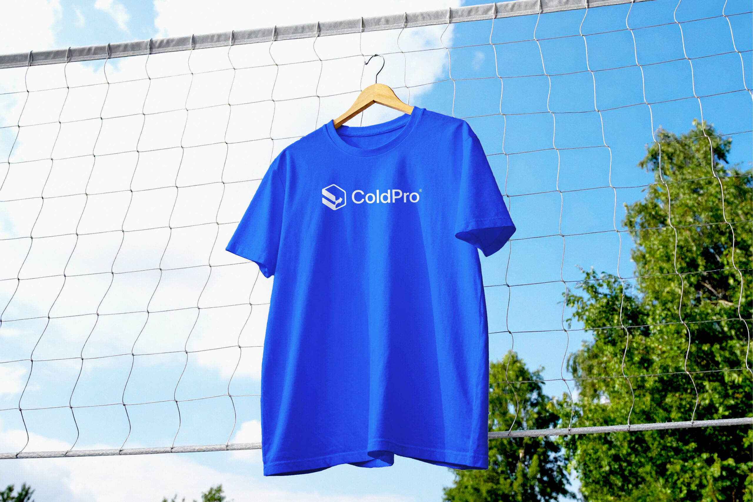
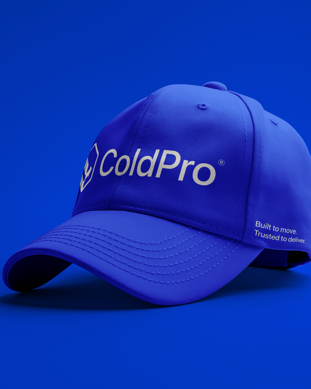
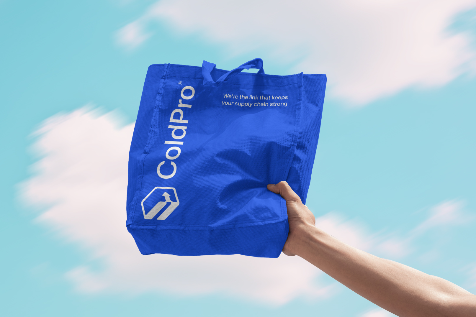
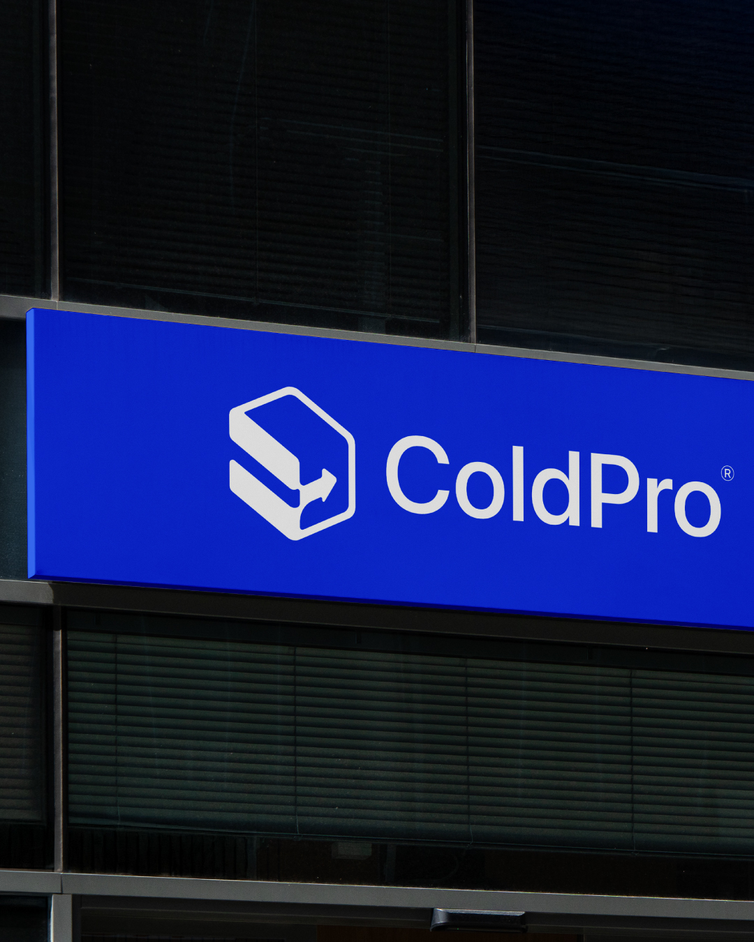
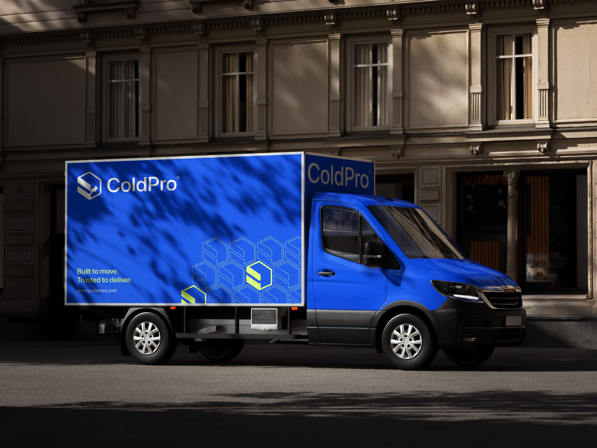
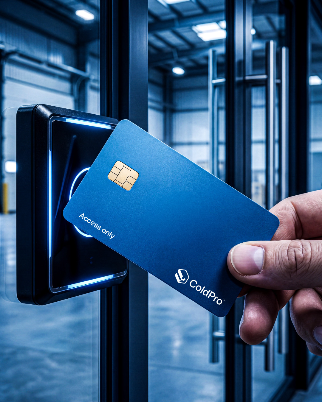
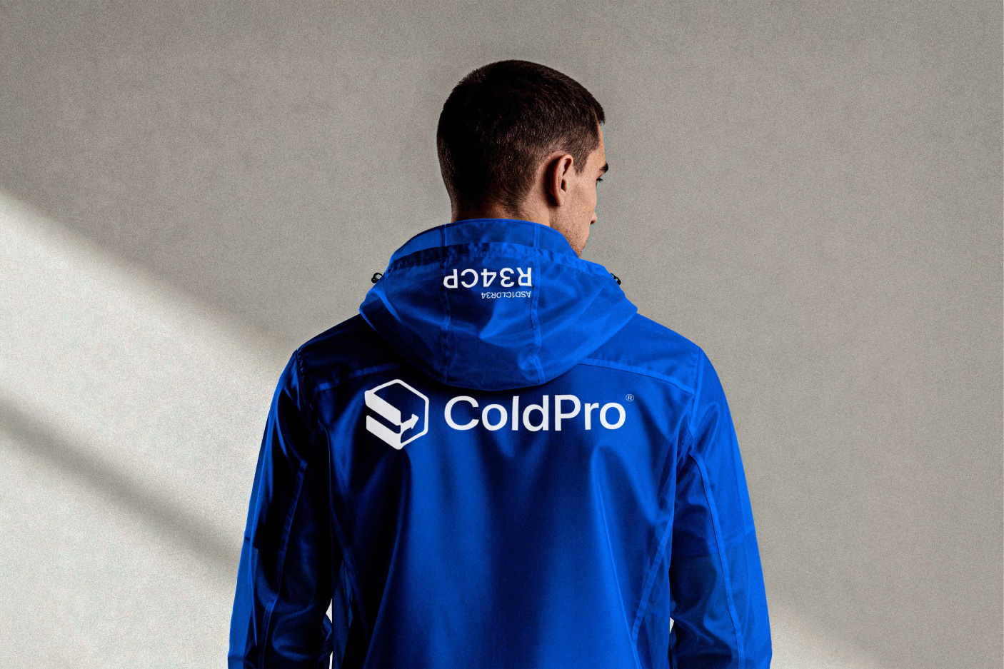
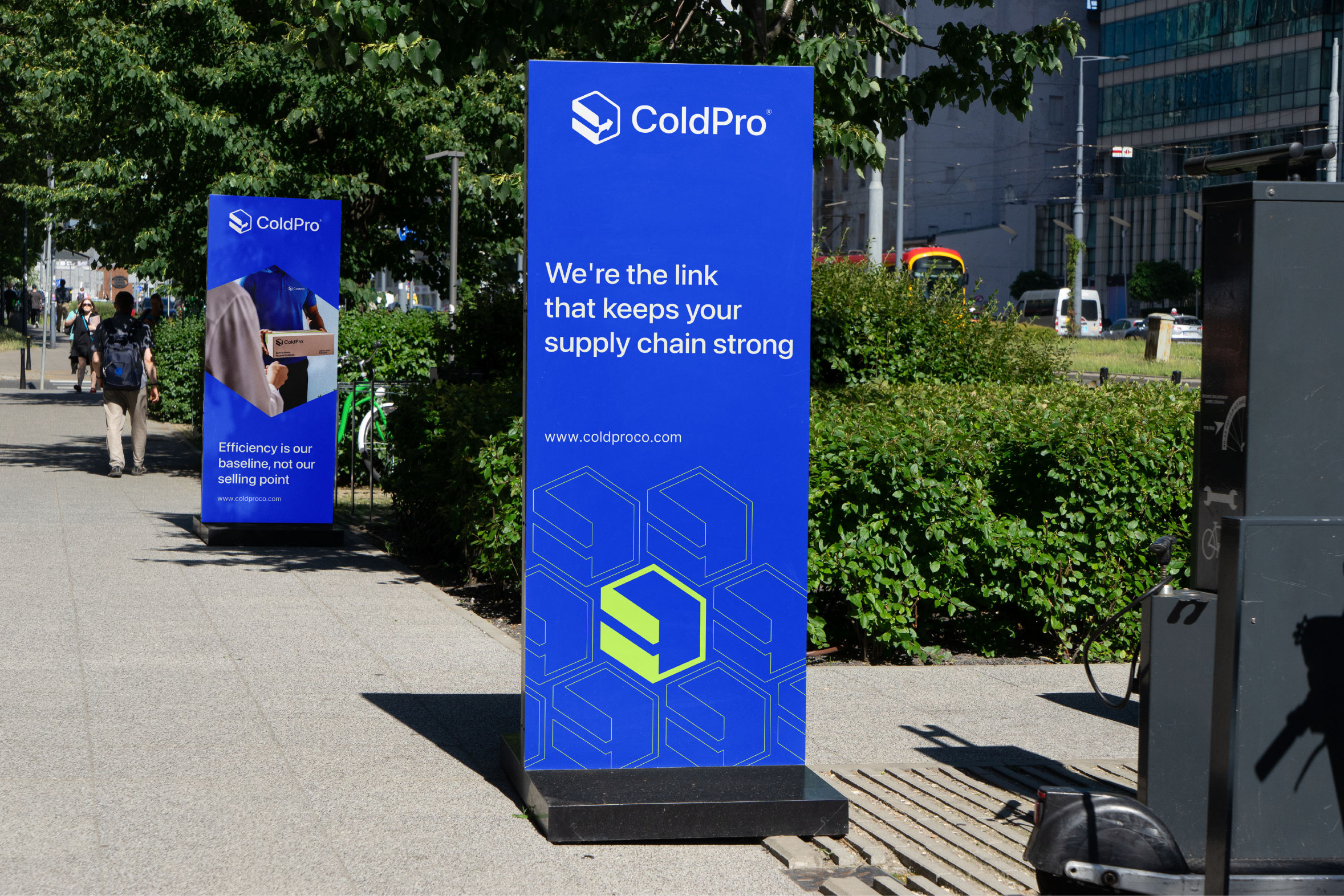
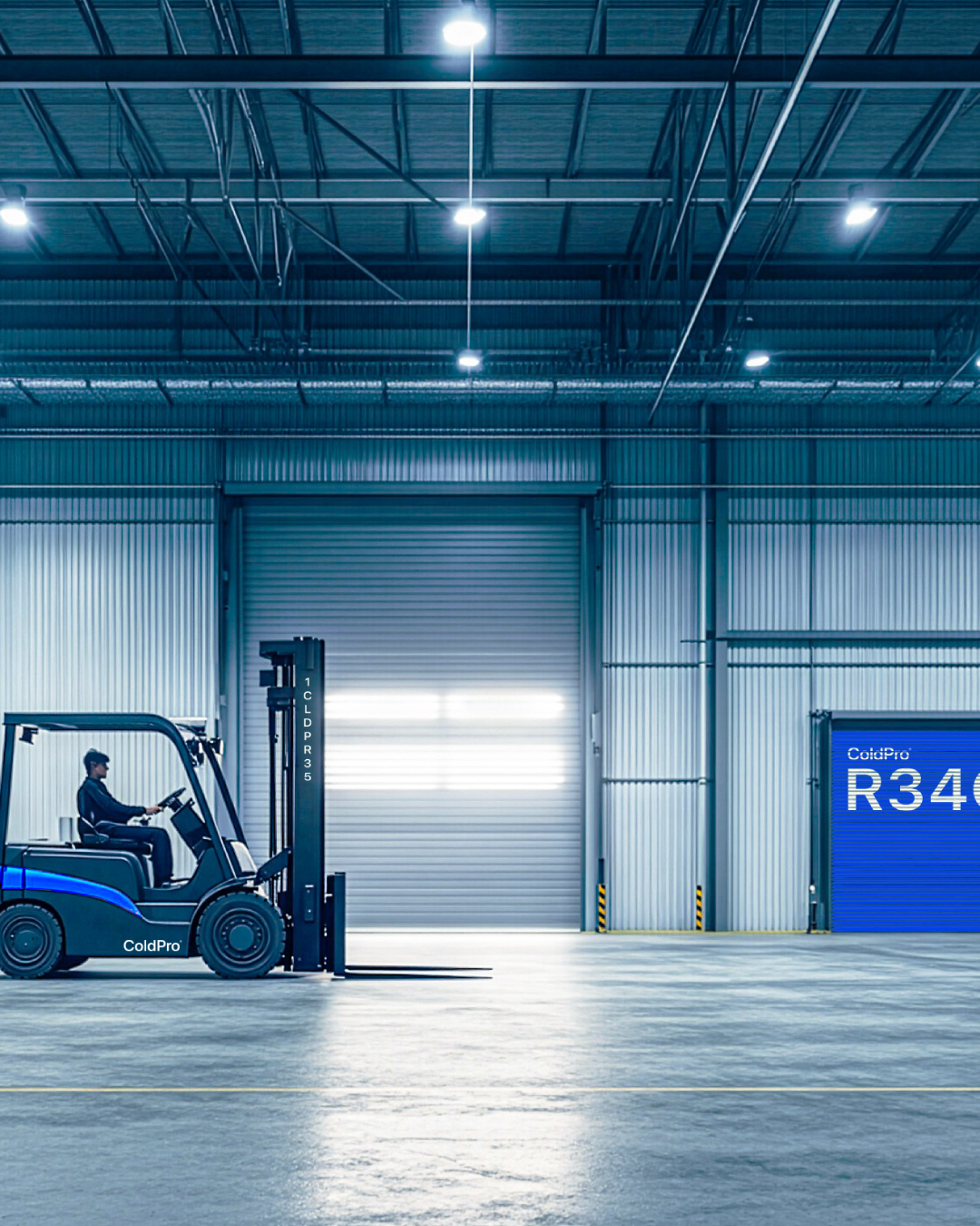
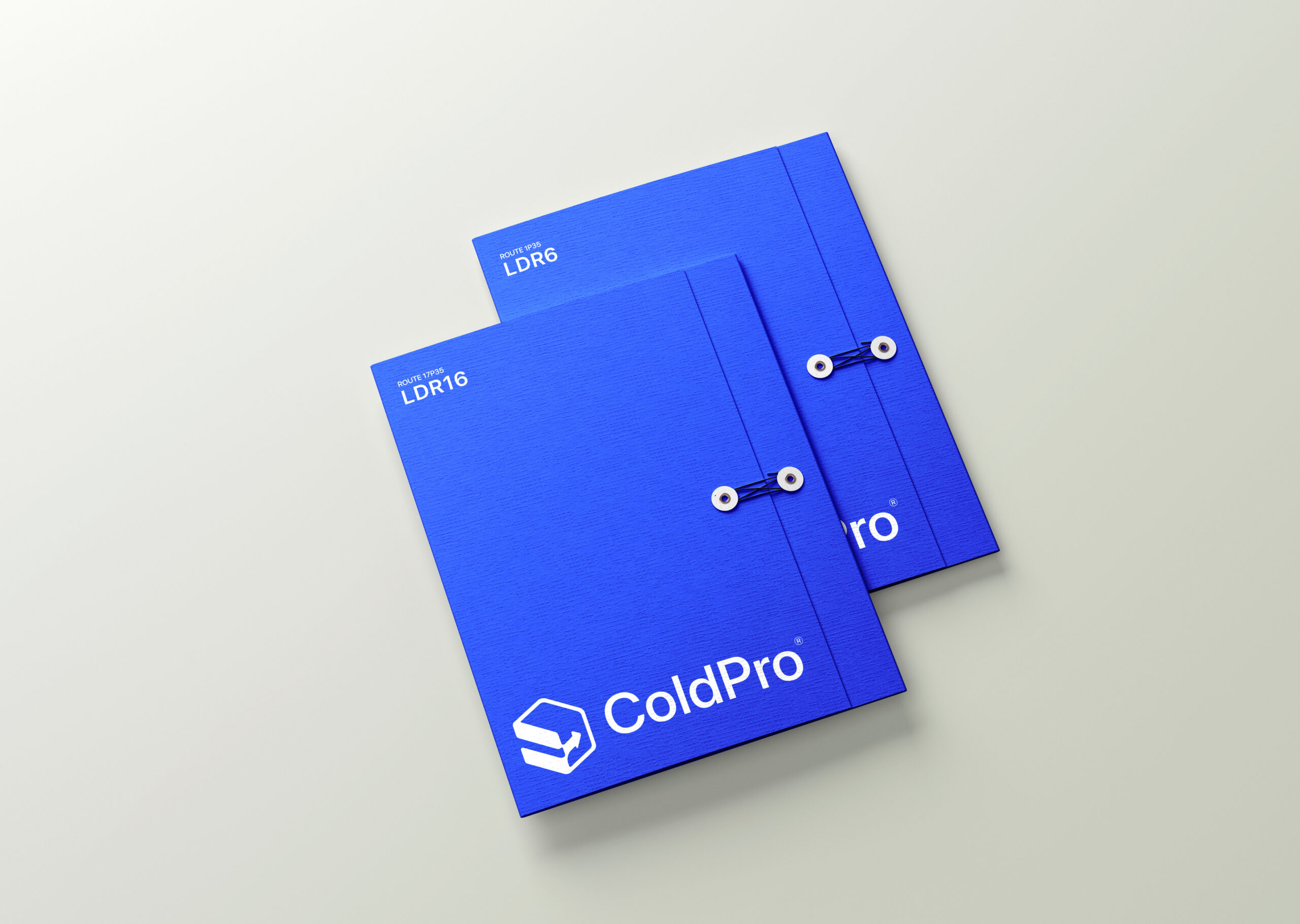
Blue was not a coincidental choice for Coldpro, it was a deliberate one.
As a colour, blue carries a near-universal association with trust, reliability, and professionalism. These are the exact qualities a cold-chain logistics brand needs to project to its audience, who needs to know their goods are in safe, competent hands.
But blue works harder for Coldpro than it does for most brands. Beyond its emotional weight, blue holds a direct visual connection to coldness, ice, refrigeration, and preservation. This means the brand communicates what it does at a chromatic level, before a single word is read. The colour isn’t just a design choice, it’s a functional one.
The specific tone of blue selected for Coldpro sits in a space that balances authority with approachability. It’s structured enough to feel corporate and credible, yet clean enough to feel modern and accessible. It avoids the rigidity of navy and the naivety of pale sky blue, landing in a mid-range that speaks to both the professionalism of the operation and the precision of the service.
In the context of the wider visual identity, blue anchors the brand’s core promise: that Coldpro is efficient, dependable, and built for the long haul